I don’t read as much English manga now as I used to, but when I read one these days, I pay attention to the translation and I pay attention to the typesetting. I’m sure it’s natural for anyone with a hobby/specialty to take a close look at the work of others in the same line of work, so to speak, and you can learn a lot by studying how other people do something. But while you can find quite a number of step by step redrawing tutorials showing how something was redrawn, it’s far rarer to find an explanation of why a particular typesetter used a particular font for a particular manga. About the only one I know is Vorbis’ guide to typesetting, which is essential reading for any budding typesetter.
So anyway, that’s where I come in. The tips and tricks like centering, using text boxes, avoiding too many size changes etc. are well covered in other typesetting guides, so I won’t focus on those too much. Instead I want to go over the works I’ve done so far and explain why I chose the fonts I’ve been using. Once you become a veteran typesetter (not that I’m one or anything) you’ll use your own tastes and judgment to pick what fits you best, but I hope this will help newbies who are starting out and are feeling overwhelmed by the thousands of fonts out there.
Before I dive into what font I do use though, this is my very general guideline for picking fonts: It has to be legible, it has to be simple and it has to look good at the size I want to use it at. Some fonts are nice in smaller sizes, but not so impressive at larger sizes, e.g. CC Jim Lee, Lafayette.
Also I’m not an expert on font evaluation, so I don’t know a thing about kerning or spacing or what makes a good bold font or a bad one, but I look for well-shaped, sensible-looking letters, i.e. A should look like A, not a triangle, R should look like R, not B, etc. There are exceptions to this, which is why it’s a guideline, not a rule, but in general I like fonts that look relatively ‘normal.’
To round off today’s post, here are four popular fonts you won’t catch me using and why not.
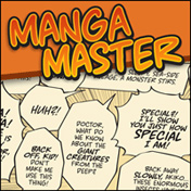
![]() 1. Anime Ace – The bane of my existence because so many typesetters use it and yet it’s so, so ugly. When I talked about A looking like A and R looking like R, it was Anime Ace I had first and foremost in mind. The letter shapes are off, the spacing is weird, it’s hard to read at anything above a size 14 and a mass of it just looks all black and ugly. There’s no art so nice that you can’t ruin it by adding some Anime Ace.
1. Anime Ace – The bane of my existence because so many typesetters use it and yet it’s so, so ugly. When I talked about A looking like A and R looking like R, it was Anime Ace I had first and foremost in mind. The letter shapes are off, the spacing is weird, it’s hard to read at anything above a size 14 and a mass of it just looks all black and ugly. There’s no art so nice that you can’t ruin it by adding some Anime Ace.
2. Comic Sans – I have toyed with the idea of using it at least once just to be ironic, but the shapes of the letters are just wrong in subtle ways and I don’t like the spaces between certain letter combinations so I’d have to manually correct them all the time. I’m not a bandwagon comic sans hater, but it really isn’t a very nice font at all.
![]() 3. Digital Strip – It’s too square and boxy for me. I’ve used it in the past (not on this blog) and I’ve seen people using it both as a dialogue and as a narration front, but it’s just too abrupt and angular for my liking. I also don’t like that slight thickening at the bottom that makes the whole thing look like it’s leaning ever so slightly to the right. I think it would work best as a one-liner, e.g. for chapter titles, but not for anything heavier than that.
3. Digital Strip – It’s too square and boxy for me. I’ve used it in the past (not on this blog) and I’ve seen people using it both as a dialogue and as a narration front, but it’s just too abrupt and angular for my liking. I also don’t like that slight thickening at the bottom that makes the whole thing look like it’s leaning ever so slightly to the right. I think it would work best as a one-liner, e.g. for chapter titles, but not for anything heavier than that.
![]() 4. Manga Temple – The only purpose I can imagine for this font is as a ‘horror’ font. The thick tops and thin bottoms of each letter make it look so distorted that it’s bound to scare a few people. It certainly scares me. And this is another font where the letters don’t look like what they’re supposed to. In the small sample on the right you can even see that the A is barely an A and the P almost looks like a D. All that distracts from immediate legibility. I wouldn’t use this as a dialogue font, no siree.
4. Manga Temple – The only purpose I can imagine for this font is as a ‘horror’ font. The thick tops and thin bottoms of each letter make it look so distorted that it’s bound to scare a few people. It certainly scares me. And this is another font where the letters don’t look like what they’re supposed to. In the small sample on the right you can even see that the A is barely an A and the P almost looks like a D. All that distracts from immediate legibility. I wouldn’t use this as a dialogue font, no siree.
Other fonts I don’t really like but that are quite common include:
 Acme Secret Agent (it’s like the bastard child of Anime Ace and Manga Temple),
Samaritan, more commonly known as CC Astro City (I’ve used it as a narration font and like it there, but I keep seeing it as a dialogue font and I don’t care much for that, especially when it’s used without regard to the tone of the manga),
Zud Juice,
Mighty Zeo Caps (the lowercase version has its uses),
Crimefighter (I like it but it’s so huge it’s hard to use),
Webletterer (same as Crimefighter) and some others I can’t recall right now because I don’t use them.
Btw I should have mentioned earlier that all this applies only to ordinary dialogue fonts. For SFX fonts and other special uses, all bets are off. E.g. I can imagine making a character send an e-mail in Comic Sans or putting a signboard in Digital Strip, but as regular dialogue fonts they just suck. This post just reached 900 words so I’ll continue at another date.

 Now I have to find a new source of terrible dramas and annoying tourism shows and endless mahjong tournaments and pro-Beijing news to watch. It was fun to have ATV streaming away whether I watched it or not, and I learned a ton of new characters and compounds from the news broadcasts. But it does no good to lament the past, just got to keep moving forward. I’m sure I’ll find something else eventually.