All right, welcome back! It’s been a while since I left off with Part 1, where I mentioned some things I usually look for when picking a font for typesetting manga with. I also took the chance to mention a few fonts I wouldn’t touch with a 20-foot barge pole, some of which might be okay for SFX fonts but all of which look terrible as dialog fonts.
Today we continue with some good dialog fonts – those for typesetters and comic book writers with deep pockets. Or not that deep, if you shop right. This is a good time for a post like this because Comicraft, “Purveyors of Unique Design and Fine Lettering” i.e. comic book fonts, will be holding their annual January 1st sale. All fonts on their site will cost only $20.15, as opposed to up to $129 for some of their priciest offerings.
Disclaimer: I’m a complete font amateur and self-taught typesetter and I’m writing this for fellow self-taught amateurs. So this isn’t meant to be professional advice at all. With that out of the way, which fonts do I personally like? Which ones would I use/have I used before in a manga? That’s what this post is here for. For Comicraft fonts, I’m partial to:
 Wildwords – Some people steer clear of Wildwords these days because at some point in the early 2000s it seemed like every typesetter and their mother was using it. That doesn’t make it a bad font though. It looks good in nearly every kind of manga and in fact seems almost tailor-made for shounen manga. It fits into the fiddliest bubbles like a dream and looks good at nearly all sizes, so it’s a great ‘starter’ font for baby typesetters. Even its ubiquity is a good thing, because it means fans won’t get caught up looking at your pretty font, they’ll just move to the meat of the story. There’s a nice-looking lowercase version as well, though the ‘d’ looks a little squat IMO.
 Joe Kubert – One of my favorites. It has a clean, open feel that makes it good for both for dense, dark manga, where it stands out in a good way, and for manga with lots of white space, where it blends right in. It does look a bit formal though, so I wouldn’t use it for anything too jokey. Also it might be a little too ‘manly’ for a very girly shoujo manga. In such cases you can either use the slightly softer and rounder Adam Kubert or…
Jim Lee – A friendly, comical looking font that works best in small doses. Too much of it or too large a size and it becomes slightly hard to follow, though still legible. I like it a lot in light-hearted manga. If it’s manga with a lot of text I’ll use something else, otherwise I like either Jim Lee or a lowercase font for the lighter stuff.
 Los Vampiros – Another font you can’t really go wrong with, with the added bonus of being much less common than Wild Words. The letters may look a bit large, but they scale up and down nicely. The ‘R’ looks a little bulbous to me, but apart from that I like it.
Digital Delivery – It’s a bit too even and robotic to be used in speech bubbles, but I’ve made good use of it for narration bubbles, especially where the narrator is one of the characters in the manga so it feels like s/he’s just writing in a diary. If you use it, try not to make it too big.
Meanwhile – A font I’ve used once instead of Joe Kubert. When used at larger sizes it can bother me a bit because of the too-large Os and the squeezy look of the Es and… am I making any sense, btw? But at normal dialog font sizes like 14-18 it looks great.
Mild Mannered – ‘Meanwhile’ without all the flaws. A much better options Maybe it’s because of the name, but I think of comics when I look at it.
I wouldn’t use: Comicrazy – Only one step above Comic Sans MS. Yes, I went there. Dave Gibbons – It’s too big. Kiss and Tell – The shape of the ‘A’ and the ‘E’ and the ‘N’ and lots of other letters feel a little ‘off’. Good for people who like slightly quirky stuff, I guess, but I would find it distracting to read. Hush Hush – It’s just ugly. Yada Yada – Ugh-ly. Tim Sale – Also ugly, also dat S. etc, etc.
Apart from Comicraft the other paid font company most people know of is Blambot. They unleashed monstrosities like Anime Ace, ACME Secret Agent and Manga Temple on the world so it’s easy to curse their name, but they also have some great paid offerings as well. As a bonus these are cheaper than Comicraft’s all year round at an average of $20 each. They also have an annual 30% off sale, which is sadly over for this year. For Blambot paid fonts, I’d recommend…
 Lint McCree Intl BB – Probably my favorite of the Blambot fonts, since even though the letters have bulges in all the wrong places, they’re all like that, so the whole thing works together. Looks great both big and small. The letter U sticks out a bit though, since it’s a bit square compared to the rounded nature of the other letters. It would be better if D was a little smaller too. Also the little ‘dash’ under the exclamation mark gives it a childish look that would make it harder to use in more serious manga. Good dialog font for a lighthearted shounen or seinen series.
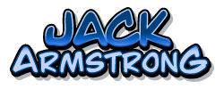 Jack Armstrong BB – A bit thick, but would look good in most kinds of manga as long as you don’t study it too closely. If you do study it, you might be bothered like I am by that triangular-looking ‘A’ or how low the lower half of the E is, same with K, and how P looks like D while R looks like a K with a boil on its head and the bottom of the U isn’t smooth enough, and on and on and on. Best to use this one in an action manga where people don’t linger over the pages.
 AntiHero BB – Another quirky, less formal font you might use in place of Jim Lee. That ‘A’ bugs me a little bit, but it still looks really nice, particularly at smaller dialogue sizes.
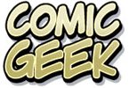 Comicgeek BB – Again, that ‘A’. I don’t know what Blambot has against A, is it because their name starts with B? If you can overlook that it’s a decent font. I’d wait for a sale on this one TBH.
Hometown Hero BB – This time they added the letter S to their victims. But Hometown Hero has an endearing “this is a comic book!”-like feel to it that will be good for more generic stuff, like a run-of-the-mill shounen, of which there are many, many.
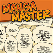
I don’t really like: Eurocomic BB – Nah. Hard to read and not that nice to look at. Might work for a comic strip or webcomic, but not for anything long. Inkslinger BB – Just look at it! MangaMaster BB – What’s ‘manga’ about those pointy bottoms and malformed Os? You can’t just throw the term ‘manga’ in front of everything. Smack Attack BB – Just wrong all over. Webletterer Pro BB – More crimes against the letter A, plus Webletterer has a free version that is only slightly uglier with no italics version. Pass.
Btw, it occurs to me that this post would be a lot more useful if I would post actual usage examples for each font. I’ll try and make it happen sometime over the holidays, maybe not for all of them but at least for some. Or I could try and create some examples, by picking a manga page and using all the fonts on the same page to make a comparison easier. I hope that’s not illegal… maybe there’s a public domain manga from the 40s or 50s out there. Anyway, I’ll look into it. Remind me if I forget.
Also while the best paid fonts usually look much better than the best free ones, you probably shouldn’t start out with those until you’ve learned basic typesetting 101 skills (refer to the link to Vorbis’ site in the previous post) and also have a better idea of the kind of manga/comic/webcomic you’ll be working on.
Okay, see you whenever I feel like putting out Part 3! In the meantime, if you know any good paid comic fonts I forgot to include (or maybe I didn’t forget because I secretly hate it), please share it below!

I started getting into manga translation, and these posts are really helpful! Looking forward to a part 3 with some good free fonts 😉
Whoops. I haven’t done any scanlation in a while so I never did come back with part 3. Will work on it when I get the chance. The paid fonts are the most stylish IMO but there are several good, free options as well.