Up to episode 18 of The Irregular at Magic High School (spoiler warning)

I kept watching out of sheer inertia, ‘cos I was too lazy to start anything else. That doesn’t mean The Irregular at Magic High School has improved much over the first 6 episodes. The second arc was a slight improvement over the first, but not enough to move the series into “good territory.”

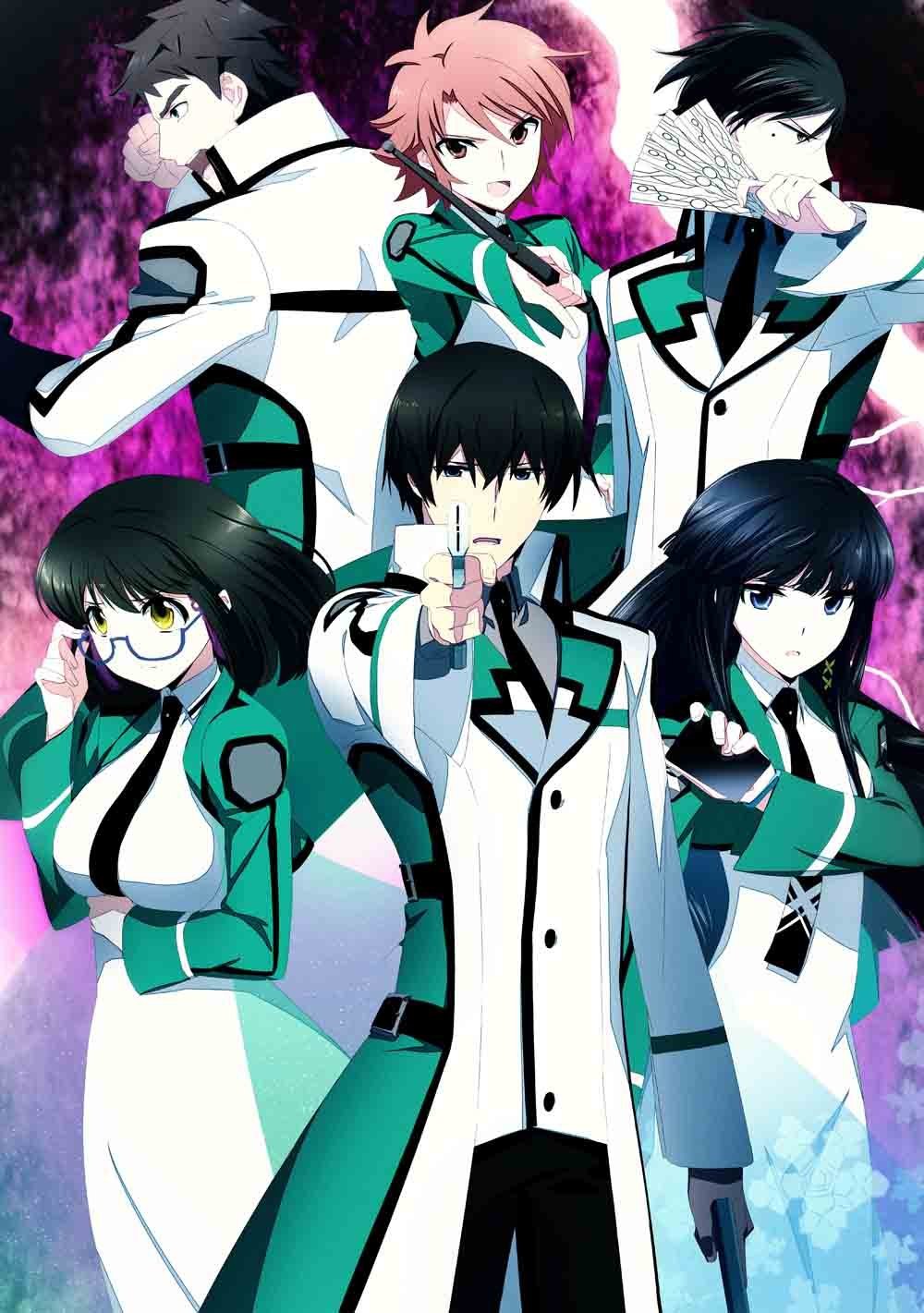
Last time I mentioned that the large number of characters hurts the series, and all the second arc did was add even more inconsequential characters who get a little attention for a few minutes and then vanish into the ether again. Honoka, for example. We get that she has a crush on Tatsuya, but… so? Erika’s brother appears, then disappears. And apparently his name is “Kentsugu” and he’s dating Mari, but didn’t Mari refer to her boyfriend as “Shu” in an early episode? Well, whatever.

In any case, a series about an overpowered hero is only good if he has someone to really show that power against. The more competent the bad guys, the better the main character looks when he overcomes them. When they’re Saturday morning cartoon villains like in this show, then it’s just like shooting fish in a barrel. I even start feeling sorry for the poor suckers.

mahouka miyuki tatsuyaThe first arc was a laughable affair, with some of  the stupidest terrorists I’ve ever seen in my life. So you want to break into the school and steal their secrets? Why do it in broad daylight when nearly all the students are present? Why not go in at night when there’s only security and maybe a few stragglers to dispose of? And once their attack on the school failed, why would they all stay huddled together in one building waiting to be taken out by anyone who cared to do it? Why not disperse and regroup later? Since they were so dumb, Tatsuya gets no points for taking them out.

But that was just the introduction, right? The subs even call it the “Orientation” arc. Then the Nine School Competition begins, which is pretty much the Olympics for magicians. And there’s a shadowy group of triad members plotting to take down our hero’s school, will they succeed? And what is Tatsuya going to do about Suzaku a super-powerful rival by name of Ichijou Masaki?

Yeah, well, he basically kicks everybody’s asses like he always does. That Ichijou guy was an overrated one-trick pony anyway. The only reason we know he’s supposed to be good is because the story says so. All he does is put some magic circles in the air, then Tatsuya jumps around all kung-fu like and stuff and then eventually beats Ichijou by snapping his fingers. …This post contains spoilers, btw.

The “fight” with the triad guys is even more pathetic, so much so it doesn’t deserve a description. He basically shoots them all from 1000 meters away after toying with them for a bit. “Nobody threatens my little sister and lives!” Good for you, Tatsuya, good for you.

tatsuya-shiba-anime-mahouka-koukou-no-rettousei
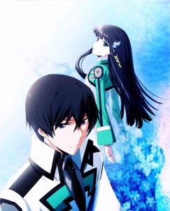
So… not much has happened since the series started except the whole world is being forced to recognize just how strong and manly and intelligent and unbeatable and wonderful and [insert 200 other superlative adjectives here] Tatsuya is. Whether you like The Irregular at Magic High School or not will depend largely on how much you like Tatsuya and enjoy watching his bored-looking efforts.

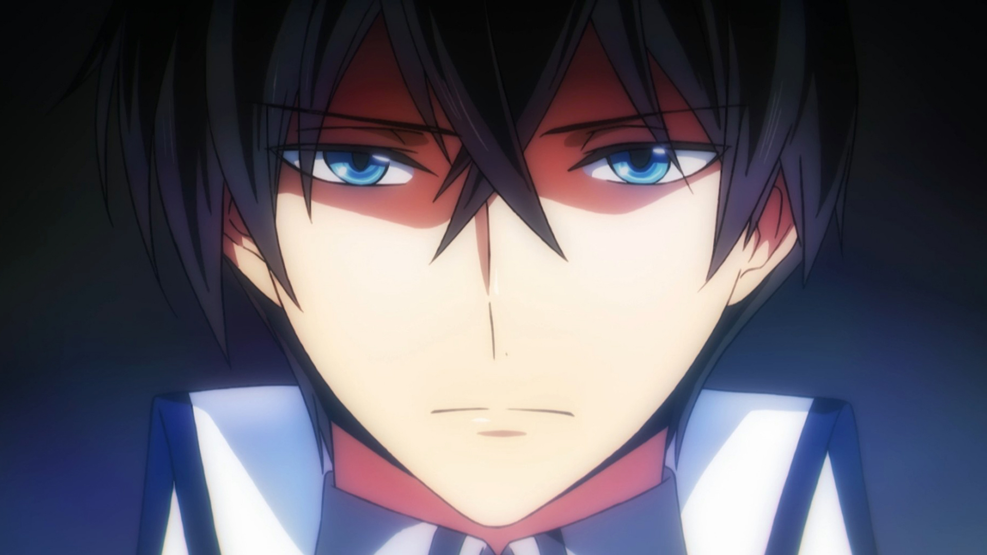
Personally I’m on the fence. I can’t say I like him, but I don’t hate him either. His characterization is a bit inconsistent though. Sometimes he says “I have no emotions except siscon love” but then he goes ahead and shows all kinds of emotions anyway, from amusement to annoyance to embarrassment to shock and surprise, so what exactly does he mean by he has no emotions? Luckily the writers aren’t skilled enough to make me care about getting to the bottom of his personality. I just wish someone strong enough to push him to the limit would show up before the series ended.

I’m going to place my final hopes on the third and last arc. Another 8 episodes and we’ll talk again.

Merry Christmas 2014

Merry Christmas!

“Here is a trustworthy saying that deserves full acceptance: Christ Jesus came into the world to save sinners – of whom I am the worst.” – 1 Timothy 1:15

Let’s not forget the real meaning of Christmas even as we’re spending precious time with friends and family scarfing down a whole month’s worth of calories in a single day. Me? Guilty as charged. Not only did I wake up too late to go to church (*sob*) but I also spent the day pigging out, playing games and sleeping. So this applies to me as much as any one. I’m enjoying spending time in the book of 1 Timothy, though. I’m reading it on my own and also listening to verse-by-verse exposition by Pastor Scott Gilchrist at EssentialChristianity.net I highly recommend that site if you’ve ever wondered what the Bible was all about.

Now then, how to spend the rest of the day? I’m wide awake now, and for some reason I’m really hungry too! Time to eat some more! Then maybe I’ll sleep some more, yay! Best, Christmas, ever.

Choosing a good font for manga typesetting (Part 2) – Paid fonts

All right, welcome back! It’s been a while since I left off with Part 1, where I mentioned some things I usually look for when picking a font for typesetting manga with. I also took the chance to mention a few fonts I wouldn’t touch with a 20-foot barge pole, some of which might be okay for SFX fonts but all of which look terrible as dialog fonts.

Today we continue with some good dialog fonts – those for typesetters and comic book writers with deep pockets. Or not that deep, if you shop right. This is a good time for a post like this because Comicraft, “Purveyors of Unique Design and Fine Lettering” i.e. comic book fonts, will be holding their annual January 1st sale. All fonts on their site will cost only $20.15, as opposed to up to $129 for some of their priciest offerings.

Disclaimer: I’m a complete font amateur and self-taught typesetter and I’m writing this for fellow self-taught amateurs. So this isn’t meant to be professional advice at all. With that out of the way, which fonts do I personally like? Which ones would I use/have I used before in a manga? That’s what this post is here for. For Comicraft fonts, I’m partial to:

wildwordsWildwords – Some people steer clear of Wildwords these days because at some point in the early 2000s it seemed like every typesetter and their mother was using it. That doesn’t make it a bad font though. It looks good in nearly every kind of manga and in fact seems almost tailor-made for shounen manga. It fits into the fiddliest bubbles like a dream and looks good at nearly all sizes, so it’s a great ‘starter’ font for baby typesetters. Even its ubiquity is a good thing, because it means fans won’t get caught up looking at your pretty font, they’ll just move to the meat of the story. There’s a nice-looking lowercase version as well, though the ‘d’ looks a little squat IMO.

joe kubertJoe Kubert – One of my favorites. It has a clean, open feel that makes it good for both for dense, dark manga, where it stands out in a good way, and for manga with lots of white space, where it blends right in. It does look a bit formal though, so I wouldn’t use it for anything too jokey. Also it might be a little too ‘manly’ for a very girly shoujo manga. In such cases you can either use the slightly softer and rounder Adam Kubert or…

Jim Lee – A friendly, comical looking font that works best in small doses. Too much of it or too large a size and it becomes slightly hard to follow, though still legible. I like it a lot in light-hearted manga. If it’s manga with a lot of text I’ll use something else, otherwise I like either Jim Lee or a lowercase font for the lighter stuff.

los vampirosLos Vampiros – Another font you can’t really go wrong with, with the added bonus of being much less common than Wild Words. The letters may look a bit large, but they scale up and down nicely. The ‘R’ looks a little bulbous to me, but apart from that I like it.

Digital Delivery – It’s a bit too even and robotic to be used in speech bubbles, but I’ve made good use of it for narration bubbles, especially where the narrator is one of the characters in the manga so it feels like s/he’s just writing in a diary. If you use it, try not to make it too big.

Meanwhile – A font I’ve used once instead of Joe Kubert. When used at larger sizes it can bother me a bit because of the too-large Os and the squeezy look of the Es and… am I making any sense, btw? But at normal dialog font sizes like 14-18 it looks great.

Mild Mannered – ‘Meanwhile’ without all the flaws. A much better options Maybe it’s because of the name, but I think of comics when I look at it.

I wouldn’t use: Comicrazy – Only one step above Comic Sans MS. Yes, I went there. Dave Gibbons – It’s too big. Kiss and Tell – The shape of the ‘A’ and the ‘E’ and the ‘N’ and lots of other letters feel a little ‘off’. Good for people who like slightly quirky stuff, I guess, but I would find it distracting to read. Hush Hush – It’s just ugly. Yada Yada – Ugh-ly. Tim Sale – Also ugly, also dat S. etc, etc.

Apart from Comicraft the other paid font company most people know of is Blambot. They unleashed monstrosities like Anime Ace, ACME Secret Agent and Manga Temple on the world so it’s easy to curse their name, but they also have some great paid offerings as well. As a bonus these are cheaper than Comicraft’s all year round at an average of $20 each. They also have an annual 30% off sale, which is sadly over for this year. For Blambot paid fonts, I’d recommend…

font_lintmccreeLint McCree Intl BB – Probably my favorite of the Blambot fonts, since even though the letters have bulges in all the wrong places, they’re all like that, so the whole thing works together. Looks great both big and small. The letter U sticks out a bit though, since it’s a bit square compared to the rounded nature of the other letters. It would be better if D was a little smaller too. Also the little ‘dash’ under the exclamation mark gives it a childish look that would make it harder to use in more serious manga. Good dialog font for a lighthearted shounen or seinen series.

font_jackarmstrongJack Armstrong BB – A bit thick, but would look good in most kinds of manga as long as you don’t study it too closely. If you do study it, you might be bothered like I am by that triangular-looking ‘A’ or how low the lower half of the E is, same with K, and how P looks like D while R looks like a K with a boil on its head and the bottom of the U isn’t smooth enough, and on and on and on. Best to use this one in an action manga where people don’t linger over the pages.

font_antiheroAntiHero BB – Another quirky, less formal font you might use in place of Jim Lee. That ‘A’ bugs me a little bit, but it still looks really nice, particularly at smaller dialogue sizes.

font_comicgeekComicgeek BB – Again, that ‘A’. I don’t know what Blambot has against A, is it because their name starts with B? If you can overlook that it’s a decent font. I’d wait for a sale on this one TBH.

Hometown Hero BB – This time they added the letter S to their victims. But Hometown Hero has an endearing “this is a comic book!”-like feel to it that will be good for more generic stuff, like a run-of-the-mill shounen, of which there are many, many.

I don’t really like: Eurocomic BB – Nah. Hard to read and not that nice to look at. Might work for a comic strip or webcomic, but not for anything long. Inkslinger BB – Just look at it! MangaMaster BB – What’s ‘manga’ about those pointy bottoms and malformed Os? You can’t just throw the term ‘manga’ in front of everything. Smack Attack BB – Just wrong all over. Webletterer Pro BB – More crimes against the letter A, plus Webletterer has a free version that is only slightly uglier with no italics version. Pass.

Btw, it occurs to me that this post would be a lot more useful if I would post actual usage examples for each font. I’ll try and make it happen sometime over the holidays, maybe not for all of them but at least for some. Or I could try and create some examples, by picking a manga page and using all the fonts on the same page to make a comparison easier. I hope that’s not illegal… maybe there’s a public domain manga from the 40s or 50s out there. Anyway, I’ll look into it. Remind me if I forget.

Also while the best paid fonts usually look much better than the best free ones, you probably shouldn’t start out with those until you’ve learned basic typesetting 101 skills (refer to the link to Vorbis’ site in the previous post) and also have a better idea of the kind of manga/comic/webcomic you’ll be working on.

Okay, see you whenever I feel like putting out Part 3! In the meantime, if you know any good paid comic fonts I forgot to include (or maybe I didn’t forget because I secretly hate it), please share it below!

Fallen Words manga review

Does a manga count as ‘alternative’ if it actually makes sense and isn’t weird at all? 😀 Or should I just keep my mouth shut and be grateful that, unlike the other stuff Drawn & Quarterly has presented, Fallen Words by Yoshihiro Tatsumi is a quick, simple and funny read?

Yoshihiro Tatsumi’s epic memoir A Drifting Life was published in 2009 to overwhelming acclaim, garnering prestigious awards around the world, landing on The New Times “graphic books” best-seller list, and inspiring a feature-film adaptation. For his follow-up, Tatsumi shifted gears dramatically, finding inspiration in the centuries-old Japanese storytelling tradition of rakugo, or “fallen words.” By fusing this comedic, performance-based art form with the visual language of manga, Tatsumi proved that, at the age of seventy-five, he is still one of the medium’s foremost innovators. Humorous, provocative, and thoroughly unpredictable, Fallen Words is a deceptively lighthearted look at the moral quandaries of life and death.

Yes, that’s the secret behind its readability – Fallen Words is simply manga retellings of age-old Japanese folk stories, so to speak. Most of them are funny, a few of them are thought-provoking, and a saddening number of them just revel in the depravity and moral decadence of the Edo Period. It’s not Tatsumi’s fault I suppose, since he is merely retelling stories that have been told and retold thousands of times over hundreds of years. But still the glorying in immorality is sad to watch.

Fallen-words-007“Although they know God’s righteous decree that those who do such things deserve death, they not only continue to do these very things but also approve of those who practice them.” (Romans 1:32 NIV). And so it is with Fallen Words, where 3 out of the 8 stories portray the deliberate destruction of innocence as a positive and even amusing occurrence of no great lasting consequence. Pathetic.

What about the other 5 stories? Those were really good, to give credit where credit is due. Some like “The Inkeeper’s Fortune” and “New Year Festival” were happy, lighthearted affairs, and “Escape of the Sparrows” actually made me laugh out loud. Others like “The God of Death” and “Shibahama” were a little more serious, and they’re the ones that look at the moral quandaries of life and death. I can see myself telling the stories to my younger nephews and nieces, with a few minor tweaks here and there.

I must say I really liked Yoshihiro Tatsumi’s style of art as well. Bold lines, simple art that nevertheless contains lots of details. The stark black and white shading with minimal of tone makes the manga feel super modern and yet super old at the same time – I really got the “life in old Edo” feel from it. I really don’t know how he did it, but the art blends with the manga world and moves the whole thing along so effortlessly you wouldn’t even know they were originally ‘rakugo’ stories to begin with.

Honestly I’d like to recommend Fallen Words to anyone who likes comedy manga, especially anyone who is interested in older Japanese culture as well, but the three bad stories “Fiery Spirits”, “Making the Rounds” and “The Rooster Crows” left a rather bad taste in my mouth. So I guess if rampant immorality doesn’t bother you then you’re in luck. For my part, hmm… maybe I’ll cut those pages out…

Goukyuu Shoujo volume 1 manga review

I got through Goukyuu Shoujo volume 1 in two 30-minute sessions. It made me feel silly for all the times I’ve forced myself to slog through some boring, low-quality manga in the hopes that it will get better. It really is the mangaka’s job to make me feel like reading more than a few pages, and despite how generically Goukyuu Shoujo (剛球少女) started out, the team of Seiichi Tanaka and Kiyokazu Chiba kept me turning the pages rapidly and left me profoundly sorry when the book was over. Time to head to Amazon and pick up Goukyuu Shoujo volume 2 and the rest of the series.

But before that, what is Goukyuu Shoujo about? If you’ve watched Princess Nine and read Shikotama or any other series where a girl tries to join a boy’s baseball team, you already know the whole story. Just as in Princess Nine, the main character Haruka Aso has a father who won Koshien and became a major league pitcher, then got embroiled in a scandal that cost him his job. In P9 the dad’s name is Hayakawa, in Goukyuu his name is Natsukawa. Both fathers also die in a car accident. Hayakawa before he was cleared, Natsukawa after, but before he could resume his major league career. Both fathers also trained their prodigiously-talented only daughters to follow in their footsteps. All coincidence? Of course not.

Gokyu-Shojo-012However whereas in P9 Ryo Hayakawa joined a girl’s baseball team, in Goukyuu Shoujo Haruka decides to join the boy’s team in her father’s high school. And, as in Shikotama, the team refuses to let her in because girls can’t play in official games so there’s no point letting her join.

I thought Haruka’s struggles to be accepted would take that bulk of the series, but luckily for her (and me!) a new trainer who just happened to be her dad’s catcher has just been hired and he thinks having Haruka on the team is a great way to shake up the status quo, so he talks the coach into letting her join. Yay!

Unfortunately her struggles aren’t over at that point. While her pitches aren’t that fast, she has great control, and she quickly uses that to strike out the team’s best player (and pitcher) during training. The main coach already wants her out, and now she’s made an enemy of the star player, and he won’t stop at anything to get her off the team. On the other hand the school principal sees her as a good PR gimmick and wants her to pitch in their next practice game… against the strongest team in the prefecture! What does the future hold in store for Haruka?

Gokyu-Shojo-102I can’t wait to find out! As I said the story was nothing new when it started out, but by the end of the first volume it has taken on a life of its own. Haruka herself has changed quite a bit. At first she was grim and gloomy, determined to make it onto the team at all costs, but once she succeeds her original (?) sunny disposition and never-say-die attitude comes to the fore.

To be honest the change does make her feel rather “generic plucky shounen hero”-like but it also makes her that much easier to root for. Cheerful, hardworking girl vs. evil opponents and jealous rivals = the stuff 50% of shoujo manga are made of, after all. Especially when the team catcher is taking more than a passing interest in our little Haruka. Mmhmm…

Enough about that, how’s the baseball action? No official games were played in volume 1, but the little pitching and fielding present was clearly and dynamically presented in an easy-to-follow way. There was rather more “standing and gaping at how awesome Player X is” present than I’m comfortable with, but it was enjoyable nevertheless.

I should also take the chance to mention that the art and the story go together really well like they were both done by the same people. I’ve read several series drawn and written by different people where it seems like the art is going one way while the story is going somewhere different. For example a character will be saying angry words, but his/her portrait doesn’t look that angry at all. Everything in Goukyuu Shoujo meshes well together, and it’s a real pleasure to read.

When I’ve gotten my hands on the 4-volume Bunkoban version I hope to be able to review the rest of the series, though I’ll do my best not to spoil the subsequent story because this is something that’s more fun to read for yourself.