Red colored elegy manga review

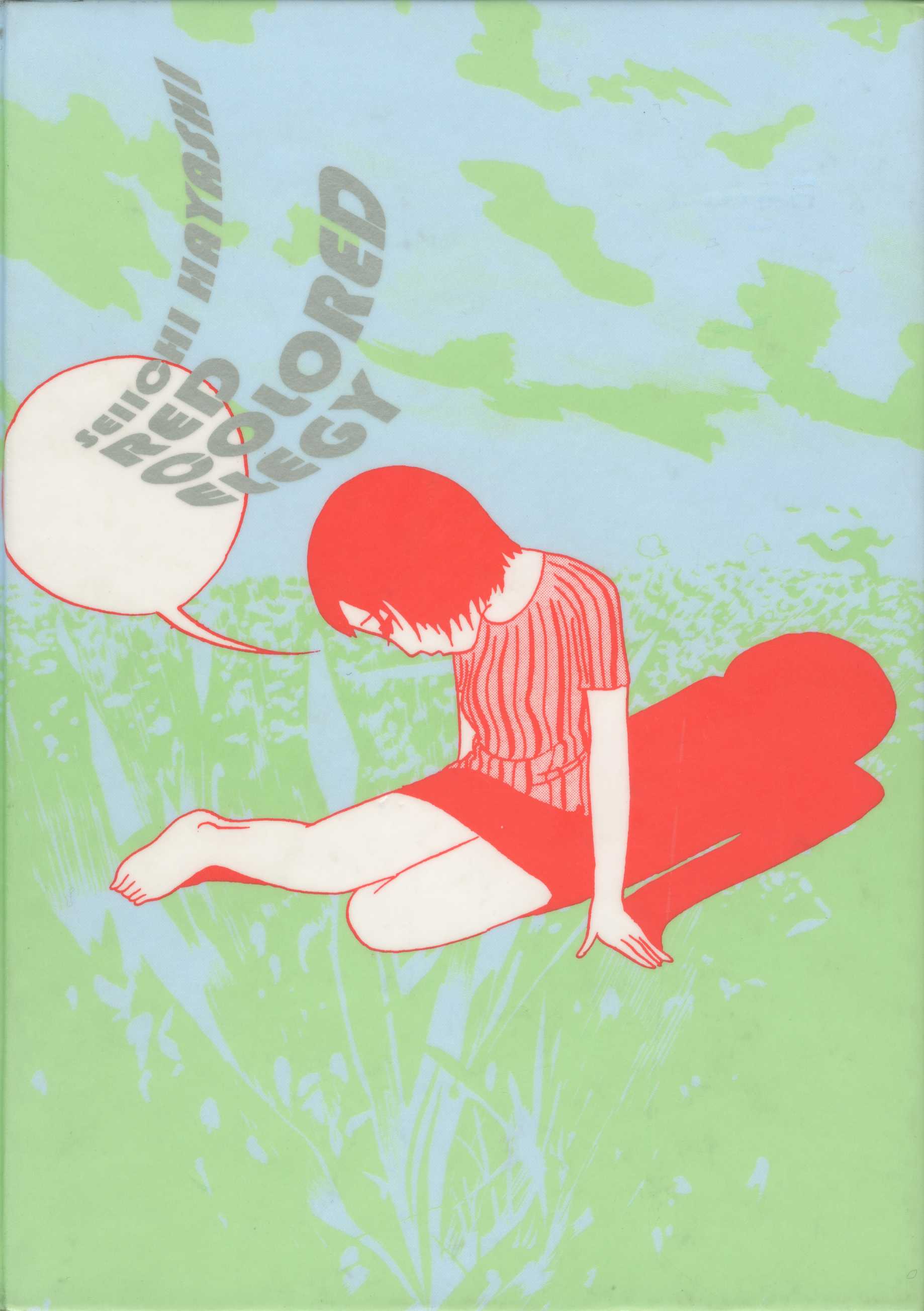
Drawn & Quarterly strikes again! But at least Red Colored Elegy isn’t anywhere near as unpleasant and as nonsensical as yesterday’s A Single Match. Red Colored Elegy is supposedly a very influential work in the history of alternative manga and narrative-wise at least I can see why. The blurb on the back of the book is unusually long and effusive, but since I’d rather spend time talking about my thoughts about the manga rather than what it’s about, I’m going to type it out anyway:

Seiichi Hayashi produced Red Colored Elegy between 1970 and 1971, in the aftermath of a politically turbulent and culturally vibrant decade that promised but failed to deliver new possibilities. With a combination of sparse line work and visual codes borrowed from animation and film, the quiet melancholy lives of a young couple struggling to make ends meet are beautifully captured in this poetic masterpiece.

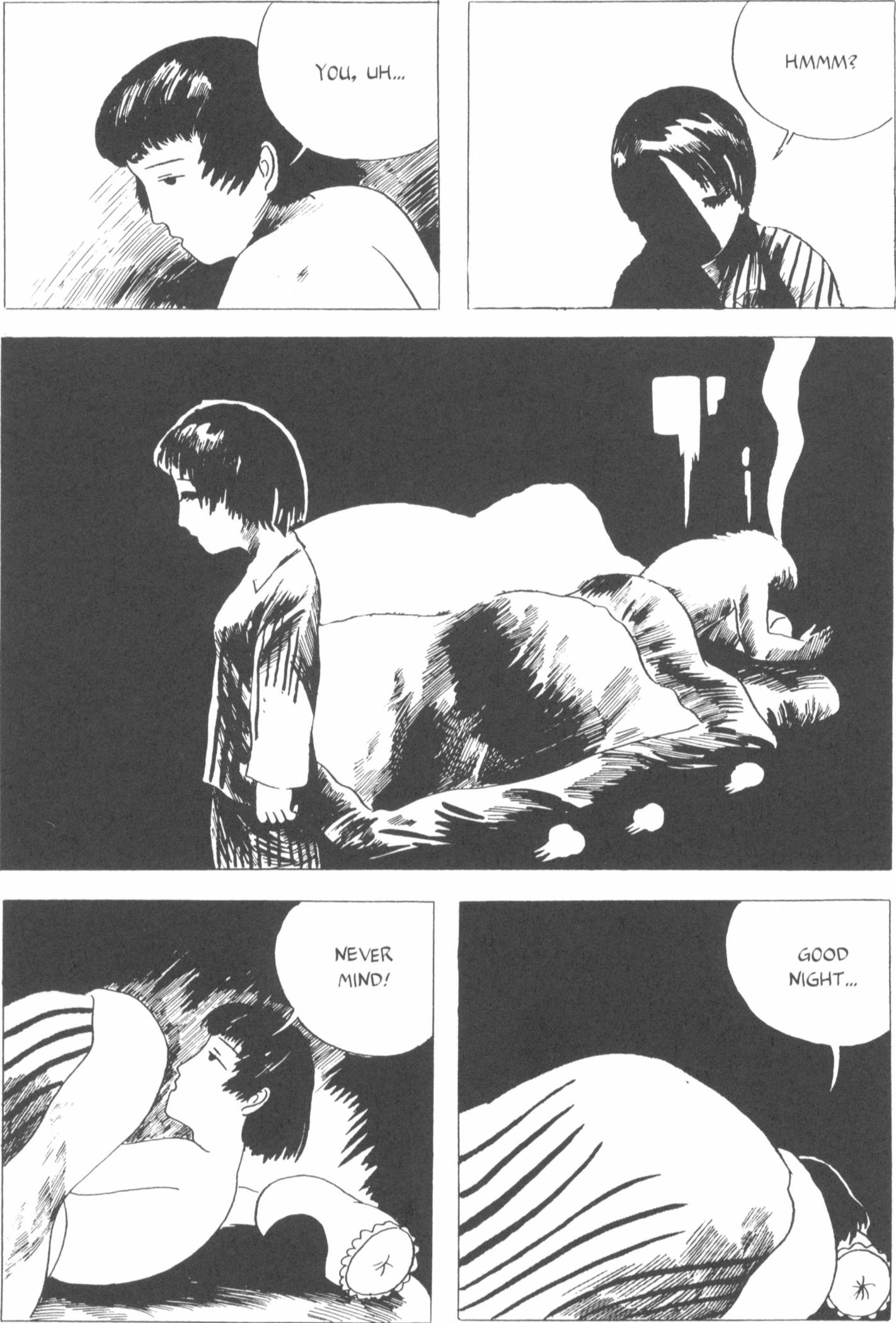
Uninvolved with the political movements of the time, Ichiro and Sachiko hope for something better, but they’re not revolutionaries; their spare time is spent drinking, smoking, daydreaming, and sleeping – together and at times with others.

While Ichiro attempts to make a living from his comics, Sachiko’s parents are eager to arrange a marriage for her, but Ichiro doesn’t seem interested. Both in their relationship and at work, Ichiro and Sachiko are unable to say the things they need to say, and like any couple, at times say things to each other that they do not mean, ultimately communicating as much with their body language and what remains unsaid as with words.

Red Colored Elegy is informed as much by underground comics of the time as it is by the French Nouvelle Vague, and its cultural referents range from James Dean to Ken Takakura. Its influence in Japan was so large that Morio Agata, a prominent Japanese folk musician and singer songwriter, debuted with a love song written and named after it.

Red Colored Elegy p015_2RSo that’s it for the content. To spoil a bit, Ichiro and Sachiko break up near the end. She moves on (or attempts to) with a coworker or hers while Ichiro slouches around getting drunk and complaining about how miserable he is – even though he’s the one who scuppered their chances at getting back together with his uncooperative attitude. Needy, whiny and unfaithful though Sachiko may be, she can definitely do better than Ichiro so their breakup is a happy ending, of sorts.

But as I said, I can see how this would be influential. The story is told in a vague, disjointed manner, but there’s a sequence to the events, there are recurring characters, things move from Point A to B in a meandering but inevitable way. As long as you make your point in the end, there’s nothing wrong with enjoying the process.

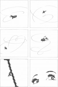
Plus I bet the “sparse artwork” style must have been a great inspiration to mangaka who can’t draw all over Japan. Interesting characters can cover mediocre art much better than bad characters/story-telling can make up for good art. That said, Seiichi Hayashi does show at several points that he’s an excellent artist when he wants to be. The idiosyncratic design choices seem to be a deliberate decision. And of course if your manga becomes a hit, critics will find something nice to say about the art no matter how bad it is. In fact it might become your signature feature, as with the author of Akagi/Kaiji.

Red Colored Elegy p053_1LThird source of inspiration: the blah-ness and dreariness of Sachiko and Ichiro’s relationship. Though sadly enough such depictions haven’t caught on as much as I would like. I’m probably reading the wrong kind of manga and should try more alternative manga (…no.) but romantic relationships in manga tend to be either over-the-top lovey-dovey with some stupid misunderstandings thrown in or thoroughly dysfunctional from start to finish but they stay together because he’s the hero and she’s the heroine.

Red Colored Elegy instead paints a realistically bleak picture of a relationship that’s going nowhere. Go to work, work work work, drink after work, come home, work some more, argue, sleep together or not sleep together, wake up the next day and start all over again. Except nothing in life ever stays the same, so external events (particularly the death of Ichiro’s father), internal conflicts and their own personal demons all conspire to drive the couple apart, most likely for good. Is that realistic or what? Not saying happy, normal relationships are any less ‘real’ but

That said, I have an innate dislike for stories about cohabiting couples, since I am morally opposed to that practice. Putting my beliefs aside, though, I think Seiichi Hayashi made an excellent case against irresponsible shacking up just by depicting Ichiro and Sachiko’s dreary everyday existence. Their lack of planning, lack of responsibility, lack of commitment despite their physical relationship, lack of exclusivity and their relationship’s abrupt end is all one big “Babies shouldn’t be making babies!” advertisement, whether it means to be or not.

That doesn’t mean I enjoyed Red Colored Elegy, though. It might be interesting for avant-garde manga buffs or people looking for a short manga light on dialog. That’s about it, really.

A Single Match (Red Kimono) manga review

A Single Match (not sure where the title Red Kimono comes from, but it seems to be an alternative title) is a weird  and boring manga brought to the west by Drawn & Quarterly, popular publishers of alternative graphic fiction. I didn’t know what “alternative graphic fiction” was before I read this, but now I know it’s just a short way of saying “weird rambling stuff that doesn’t make much sense but no one wants to admit they don’t get it, so they call it ‘alternative’.” It was so bad that I barely made it through the first three chapters. Still I’m glad I tried it just because now I know better than to pick up anything ‘alternative’ next time.

The story summary as given on the book jacket:

Garo’s gekiga Oji Suzuki explores memory, relationships, and loss with shifting narrative and a splash of surrealist humor. A young man catches a cold after being soaked in the rain and is tended to by his grandmother. He drifts, dreaming of a train trip with an older brother he doesn’t have. A traveling salesman comes across a boy lying in the middle of the road and stops to have a cigarette and tell a story that flows through memories of faces and places. A young woman walks along the river with her bicycle and a friend—who is nothing more than a disembodied head—discussing past times together, memories they have of each other. Suzuki masterfully plumbs the dissolute depths of the human condition—neediness, disappointment, and betrayal. He literally bathes his characters in expansive shadows that paradoxically reveal as much as they obscure. Suzuki is one of the most talented and poetic alternative cartoonists in Japan. A Single Match is his first English collection.

If that sounds like something you might like, go for it. For me it was just disturbing, disgusting and nonsensical. I mean, I can kind of see what the attraction is supposed to be: Suzuki describes vague snatches of people’s lives and leaves you to fill in the gaps. What happened before, what happened afterwards, what’s really going on, that sort of thing.

If I had to summarize the overall effect, though, it’s like a puddle of vomit. If you stare at it long enough you can pick out individual bits – that used to be a burger, that wobbly bit was probably a hot dog and so on, but at the end of the day you’re still staring at a puddle of vomit. It may sound like I’m using strong language, but the unpleasant events of chapter 2 in particular made me want to retch, hence the analogy.

tl;dr – If you like to spend time trying to make sense of stuff that doesn’t really make sense in the first place, A Single Match might be your thing. In fact, here’s a “proper” review by someone who’s paid to find the good in the worst of things: The Comics Journal review of A Single Match. However if, like me, you’re just looking for regular, ‘normal’ manga to read, avoid avoid avoid.

Maria the Convenience Store Girl volume 1 manga review

Maria the Convenience Store Girl is a 4-volume seinen slice of life manga written and illustrated by Mitsuru Miura. It was licensed in English by Netcomics and can still be read on their site for a small fee ($0.25 per chapter. I shudder to think how little the translator was paid). The Netcomics summary looks like this:

Maria is a sweet country girl who ventures to Tokyo to honor a favor for her late grandmother. Waiting for her at her destination – the Rosy Convenience Store in Misakigaoka – are the Tomekichi brothers, struggling with an increasingly senile grandfather, a clueless father, and a family business on the verge of bankruptcy. All seems hopeless, until one day Maria turns up on their doorstep – to the dismay of one brother in particular. To complicate matters, there are moody customers, ever-present food issues, and a shady inspector ready to strike at any moment.

Will Maria be able to save this little convenience store? Or is it doomed to fold?

A fun story that deals with life, love, and lunch, “Maria, The Convenience Store Girl” will make you feel warm inside–and maybe even a bit hungry!

Of course she’s going to be save it, otherwise this manga wouldn’t even exist. Maria is basically a perfect angel from on high who charms anyone and everyone she deals with in two pages flat. She’s earnest, naive, friendly, innocent (even when she’s randomly stripping to provide fanservice) and basically everything you would expect of a generic Mary Sue. They could easily have titled the series “Mary Sue Saves The Day,” since that is what every chapter boils down to.

No matter how serious the issue, whether it’s something minor like customers with dirty feet or something major like a woman trying to pass another man’s baby off as her boyfriend’s, all Maria has to do is smile and/or plead earnestly and everyone falls down at her feet and worships her knowledge and wisdom. “Maria showed me the error of my ways” is their everlasting refrain. It is ridiculously cheesy how she always ends up being the perfect solution to everyone’s problems. How Tokyo ever got along before she came along is beyond me.

Since that’s the case, there’s no need for me to read more than one volume of Maria the Convenience Store Girl. Heck, there’s no need to even read more than two or three chapters. Problem arise -> Maria solves it easily -> Everyone sings her praises -> Repeat from start. Even if more complex matters do arise in later volumes, it’s obvious she’s just going to solve them in her ‘innocent, country girl’ way, so there’s no reason to read it. The supporting cast only exists to make her look good, the art isn’t anything special, the little ‘comedy’ present is laughable, but not in a good way and long story short there’s no real reason to get this manga, not even for $0.25 a chapter.

Hei no Naka no Korinai Menmen manga review

Sorry for the long break. I’ll continue my discussion on good fonts for manga typesetting later on. Today I’m continuing my love for baseball manga by which has led me to attempt to read just about anything labelled as a ‘baseball’ manga. The only problem is that Mangaupdates’ categories are seemingly written by people who haven’t actually read the manga in question, so as with Iruka-chan ni Yoroshiku, it turns out the sport played in Hei no Naka no Korinai Menmen is softball, not baseball. A later chapter even explains why certain sports, particularly sumo and regular baseball were banned from the prisons. But I’m getting slightly ahead of myself.

The Hei no Naka no Korinai Menmen (塀の中の懲りない面々)manga is an adaptation of an autobiographical novel by Jouji (George?) Abe, probably better known by Western fans as the writer of Rainbow. I haven’t actually read Rainbow, but it won the 2005 Shogakukan Manga Prize, got an anime recently and receives regular translations, so I figure most people must know it.

The original Hei no Naka novel came out in 1986 and was a smash hit, Japan at the time being relatively favorably disposed to yakuza tales. The book spawned a TBS drama, a movie and this manga and even won an award for introducing a new catchphrase, “— menmen” into the Japanese language.

Hei-no-Naka-172
Sample done by me. The original manga is in Japanese only.

What’s the book actually about, though? The title should tell you: “Hei no naka” = literally “within walls” i.e. in jail and “korinai menmen” = literally “people who haven’t learn their lesson.” Maybe something like “Unrepentant Jailbirds” would be a good title in English.

The manga chronicles Abe’s time in jail for… I forget exactly what he did. Does he ever say? Not sure, but he was definitely guilty. Most chapters focus on different individuals he encounters within the prison system. While there is a recurring cast of regulars, most chapters can be read on their own as standalone chapters.

That’s it for the content. Is the manga any good? Alas, it’s lacking quite a bit. It’s only 2 volumes long, but I suffered before I could even finish volume 1 and didn’t bother with the second one. Artistically speaking the art is clean, the character designs are simple but memorable, the panels are simply and effectively laid out, etc, etc. There’s nothing to complain about visually.

The problem is, the Hei no Naka manga sticks way too faithfully to the source text. It’s more like a heavily-illustrated novel than like a manga. It’s most likely because nothing much happens in the novel (which I haven’t read). To cut a long story short, most chapters consist of page after page of people just sitting around talking with these huge dialogue boxes full of reams of text over their heads. And they don’t talk about anything important either, just complaints or ranting about society (which is rich coming from the dregs of society) or Prisoner X explaining Prisoner Y’s background at length to the other prisoners, that sort of thing.

Hei-no-Naka-181

I must also take issue with the “golliwog”-style design of the African character in chapter 8. The other characters all have clearly defined features (though the slitty-eyed Chinese man is… not cool) but John Karbo is just this black mass with eyes and a vague nose and thick lips. And you thought blackface was a thing of the past. It’s a documented fact that some people in West and East Africa have very dark skin, but they aren’t featureless golliwogs the way this manga portrays them. I’m going to put it down to Japan being very ignorant about Africa back in 1988 and an overzealous artist trying their hardest to convey the “blackest of the black” skin the author calls for.

tl;dr Hei no Naka no Korinai Menmen is not a very interesting manga -the premise and the setting are intriguing, but the execution lacks a lot. If you like wordy, slice of life manga where nothing much happens you could do worse than this, but otherwise it’s not that great. If Jouji Abe’s story of his life in prison interests you, see if you can find the movie or the TV drama instead.

Choosing a good font for manga typesetting (Part 1)

I don’t read as much English manga now as I used to, but when I read one these days, I pay attention to the translation and I pay attention to the typesetting. I’m sure it’s natural for anyone with a hobby/specialty to take a close look at the work of others in the same line of work, so to speak, and you can learn a lot by studying how other people do something. But while you can find quite a number of step by step redrawing tutorials showing how something was redrawn, it’s far rarer to find an explanation of why a particular typesetter used a particular font for a particular manga. About the only one I know is Vorbis’ guide to typesetting, which is essential reading for any budding typesetter.

So anyway, that’s where I come in. The tips and tricks like centering, using text boxes, avoiding too many size changes etc. are well covered in other typesetting guides, so I won’t focus on those too much. Instead I want to go over the works I’ve done so far and explain why I chose the fonts I’ve been using. Once you become a veteran typesetter (not that I’m one or anything) you’ll use your own tastes and judgment to pick what fits you best, but I hope this will help newbies who are starting out and are feeling overwhelmed by the thousands of fonts out there.

Before I dive into what font I do use though, this is my very general guideline for picking fonts: It has to be legible, it has to be simple and it has to look good at the size I want to use it at. Some fonts are nice in smaller sizes, but not so impressive at larger sizes, e.g. CC Jim Lee, Lafayette.

Also I’m not an expert on font evaluation, so I don’t know a thing about kerning or spacing or what makes a good bold font or a bad one, but I look for well-shaped, sensible-looking letters, i.e. A should look like A, not a triangle, R should look like R, not B, etc. There are exceptions to this, which is why it’s a guideline, not a rule, but in general I like fonts that look relatively ‘normal.’

To round off today’s post, here are four popular fonts you won’t catch me using and why not.

anim_ace51. Anime Ace – The bane of my existence because so many typesetters use it and yet it’s so, so ugly. When I talked about A looking like A and R looking like R, it was Anime Ace I had first and foremost in mind. The letter shapes are off, the spacing is weird, it’s hard to read at anything above a size 14 and a mass of it just looks all black and ugly. There’s no art so nice that you can’t ruin it by adding some Anime Ace.

2. Comic Sans – I have toyed with the idea of using it at least once just to be ironic, but the shapes of the letters are just wrong in subtle ways and I don’t like the spaces between certain letter combinations so I’d have to manually correct them all the time. I’m not a bandwagon comic sans hater, but it really isn’t a very nice font at all.

digital_strip03. Digital Strip – It’s too square and boxy for me. I’ve used it in the past (not on this blog) and I’ve seen people using it both as a dialogue and as a narration front, but it’s just too abrupt and angular for my liking. I also don’t like that slight thickening at the bottom that makes the whole thing look like it’s leaning ever so slightly to the right. I think it would work best as a one-liner, e.g. for chapter titles, but not for anything heavier than that.

manga_temple04. Manga Temple – The only purpose I can imagine for this font is as a ‘horror’ font. The thick tops and thin bottoms of each letter make it look so distorted that it’s bound to scare a few people. It certainly scares me. And this is another font where the letters don’t look like what they’re supposed to. In the small sample on the right you can even see that the A is barely an A and the P almost looks like a D. All that distracts from immediate legibility. I wouldn’t use this as a dialogue font, no siree.

Other fonts I don’t really like but that are quite common include:

samaritan cc astro city fontAcme Secret Agent (it’s like the bastard child of Anime Ace and Manga Temple),
Samaritan, more commonly known as CC Astro City (I’ve used it as a narration font and like it there, but I keep seeing it as a dialogue font and I don’t care much for that, especially when it’s used without regard to the tone of the manga),
Zud Juice,
Mighty Zeo Caps (the lowercase version has its uses),
Crimefighter (I like it but it’s so huge it’s hard to use),
Webletterer (same as Crimefighter) and some others I can’t recall right now because I don’t use them.

Btw I should have mentioned earlier that all this applies only to ordinary dialogue fonts. For SFX fonts and other special uses, all bets are off. E.g. I can imagine making a character send an e-mail in Comic Sans or putting a signboard in Digital Strip, but as regular dialogue fonts they just suck. This post just reached 900 words so I’ll continue at another date.